Prerequisites
- Create a model with the data you need. See our knowledge base article, Create a new model.
- Open an existing page or create a new one. See our knowledge base article, Add a new page and header.
Procedures
Add a Detail block to your page
-
- On your page, select ADD CONTENT, and in the Content dialog box, select the Detail block.
- Scroll down and in the Title box, give your Detail block a meaningful name.
- From the Model list, select the model whose data you want to appear in the Detail block.
- Select SAVE.
Configure your Detail block's property fields
-
- In the Properties list, select X on any properties you don't want to include.
- Allow related models to be updated in the same form - you may have occasions where you need to update related models at the same time as updating your main model. For example, if you have a form to change someone's manager and update the manager, you may need to update new direct reports and/or add multiple attachments to the form. This is where multi-rows come in. To enable you to create a multi-row, your main model needs to have a child model connected to it.
- Select CONTINUE.
Design your Detail block
-
- The system designs your form's order based on the order you entered the properties in the previous step.
- Select the individual fields for additional configuration options. These include:
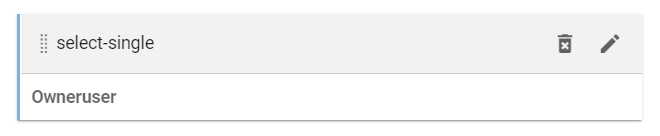
- Drag and drop - select and drag the gray bar above the form field to your desired spot and release when you are happy.
- Delete - Select the trash icon in the gray bar to delete the form field.
- Edit - Select the pencil icon to open the Edit field dialog box.
You can remove any fields you've hidden from view by clearing the Show hidden fields option.
- Optionally, add an interaction to your block. Scroll down the page to see the Form Interaction section. See our knowledge base article, Add a new form interaction.
- When you are happy with your form, select CONTINUE.
Customize General content settings for your block
Action buttons
- Under General content settings, next to Action buttons* select the plus "+" icon.
- In the Title box, type in the text you want to appear on your button.
- Under the Type of action section, from the Opens in: list, select what and how you want the button to open.
- Open page - Loads the Target list with pages from your Applaud tenant.
- URL - You need to type in the full website address in the Target box.
- Regular / Same tab - Takes the user away from the current page to the new page.
- Modal - Keeps the user on the page but opens a dialog box with the new page contained in it.
- New tab - Opens a new tab in the user's browser with the new external website.
- From the Target list, select a page from the available pages in your Applaud tenant or type the complete URL address, for example, https://www.google.com.
- From the Icon list, select an icon for your button and from the Color picker, select a color for your button.
- From the Weight list, select how you want your button to appear:
- Normal - The button appears with a colored rectangle background with black text.
- Light - The button doesn't have a background, and the text is your selected color.
- From the Hide/show based on a model property list, select a property, and then from the Condition list, select either the Hide if true option or the Show if true option.
Show the title and header bar
Hiding the title and header bar also hides any action buttons you may have included.
If you don't want a title on your block, clear the Show the title and header bar option.
Preferred width
These options are affected by your Page layout options, which you configure in the Page settings dialog. See our knowledge base article, Configure your page settings.
To configure how wide you want your block, from the Preferred width list, select an option:
- Automatic - Spans the width of the column on the page depending on what page layout option you have selected.
- Full-width - Spans the width of all columns but doesn't go beyond the margins on either side of the page unless you select the Edge-to-edge option.
- Two-third - If you have a three-column page layout, this spans across two of the columns. If you have a two-column page layout set, this spans just beyond the first column, but further blocks won't appear above the advert in the second column, only below it.
- Half-width - If you have the three-column page layout, this spans across a column and a half. If you have a two-column page layout, this spans one column.
Background color
To set the Background color of your block, select the color of your choice. The color picker shows a list of preconfigured colors with 100% opacity or fully opaque.
-
Color palette
A chart of preconfigured colors. Scroll down to see more colors. Not available in the call-to-action content block. -
Color gradient panel
A mixture of two linear color gradients. Once you select a color from the palette, you can use this panel to pick the color you want. -
Sample color
Shows the color you've chosen, and that will be applied. -
Hue slider
A linear gradient of colors. You can choose the main hue you want. -
Opacity slider
Controls the transparency of the color. Use it to brighten or darken your chosen color. -
Color mode
If you know the HEX (Hexadecimal) code you want to use, you can enter it here. You also have the option to toggle to two other formats.
RGBA - (red, green, blue, alpha) decimal values.
HSLA - (hue, saturation, lightness, alpha) values.
Hide block on certain screen sizes
If you want to prevent this block from being displayed on specific devices from the Hide on list, select those conditions where you want to hide this block.
Hide or show this block using filters
Show or hide this content block when certain conditions are met. For example, show to a manager but hide from a non-manager. You can base these filters on anything, such as job role, department, or location.
- Select the Hide or show this block using filters option.
- Under the Conditions section:
- Hide when ALL of the following conditions are met (and) - If you want to hide this block when the selected data meets every condition you add, add a condition under this section.
- Hide when ANY of the following conditions are met (or) - If you want to hide the block when the selected data meets just one of several conditions, add your conditions under this section.
- From the Property list, select the model's property.
- From the Criteria list, select the condition you want the property value to meet for the block to be hidden.
- In the Value box, enter the property's value you want the condition to meet for the block to be hidden.
- For lookup properties, you can select a lookup option.
- For foreign key properties, you can select any values against the default label property of the linked model. However, if there is nothing to select, there might not be any values for the property.
Finish
Once you have chosen your options, select UPDATE.