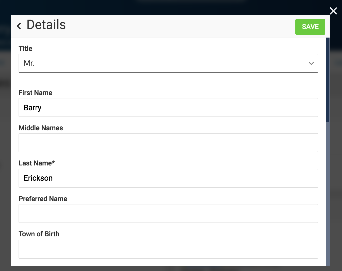
A user can fill out and submit a form, for example:
A form can be presented in many ways:
- To enter new information, perhaps with some pre-populated information
- To correct or update existing information
- A read-only view of information, optionally with just a tiny number of updateable fields
A form can be designed using the Form builder.
Form builder
The app comes with a powerful form builder that lets you design your forms. This helps capture data more accurately, more efficiently, and with reduced data input errors.
With the form builder, you can:
- Set basic properties on the form, such as its label
- Define an unlimited number of fields in your form
- Define the order of the fields
- Create lots of different types of fields, such as text inputs, drop-down lists, checkboxes, flexfields
- Set the properties of each field, such as its label, default value, whether it's required or not
- Hide or show fields based on other field's property
- Define the values that you see in lists
- Group fields into containers
- Embed child forms to allow for multi-row master-detail entry
- Create custom rules to alter form properties at run-time based on advanced conditions. For example, hide a field based on an employee's grade, set a field to required based on whether the user is a manager or not, etc.
Form fields
The Form builder offers many different fields so you can choose the appropriate input according to your business requirements.
The following form fields are available (the most common ones use a bold typeface):
| Type of field | Description |
|---|---|
| Attachment | Deprecated, use Upload instead. This is a legacy field used to upload attachments in flexible blocks. It is converted at run-time to an Upload field instead. File upload security applies to both Attachment and Upload fields. |
| Checkbox | A checkbox indicates a boolean value, such as Yes/No, True/False, On/Off. |
| Container | A visual container with a label that is used to group fields together. |
| Date | Captures a date. This supports multiple languages and the Islamic calendar. |
| Datetime-Local | Captures a date and time in the user's local timezone. This supports multiple languages and the Islamic calendar. |
| Captures and validates an email address. | |
| Flexfield | Show and interact with an Oracle E-Business Suite key or descriptive flexfield |
| Hidden |
Used to store a hidden value in the form that cannot be modified by the user. Hidden values can be altered using browser developer tools so never trust them. Use them for convenience only. |
| Html | Shows formatted HTML. Read-only. |
| Item | Contains an individual item as it would show in a list block. Usually read-only but the item itself may support updates independently of the form. |
| Link | Show a link to another web page. Read-only. |
| List | An embedded list, as it would be shown on a list block. Usually read-only but the items themselves may support updates independently of the form. |
| Multirow | References a child form, which is used to represent each row in a master-detail multi-row. |
| Number | Captures an integer or decimal number. |
| OLMQuestion | Accepts an OLM Question Id and automatically renders the field according to that question's setup. |
| Password | Captures a password, usually for sign-up or sign-in forms. |
| Radio | A radio group that allows a user to select one of several available radio buttons. |
| Select-Multiple | A select list where multiple values can be selected. |
| Select-Single | A select list where only one value can be selected. |
| Submit | A submit button. Used for an alternative way to submit the form when hiding the form's submit button. |
| TextArea | Used to enter larger amounts of text, such as multiple lines. |
| TextInput | Used to enter smaller text values, such as a few words or a single line of text. |
| Time | Used to enter a time. |
| Upload | Used to upload a file to the server. See File upload security. When viewing an existing uploaded file, this shows a preview of the file if it's an image. |